If you're looking to add default tabs across all product detail pages with general information like your Return Policy, or perhaps a Shipping Policy, or if you want to also create custom tabs and information for each product page, then read below for how to add (Common and Custom) tabs to your Shopify product detail pages.
Above you'll see an example of what the tabs will look like. You can always customize the look with the provided CSS code below.
Step 1: Add the script below, anywhere inside the theme.liquid file found in the Layout section.
<!-- Pelican Commerce Tab Script (Theme.Liquid Area) -->
<script>

document.getElementById("defaultOpen").click();
function openCity(evt, cityName) {
  var i, tabcontent, tablinks;
  tabcontent = document.getElementsByClassName("tabcontent");
  for (i = 0; i < tabcontent.length; i++) {
    tabcontent[i].style.display = "none";
  }
  tablinks = document.getElementsByClassName("tablinks");
  for (i = 0; i < tablinks.length; i++) {
    tablinks[i].className = tablinks[i].className.replace(" active", "");
  }
  document.getElementById(cityName).style.display = "block";
  evt.currentTarget.className += " active";
}
</script>
Step 2: Go to the Sections area and find the product-template.liquid file (or similar file name). This file will be where you find the product detail page elements like "product.description."
Locate the product.description and add the below code in its place. Just paste this code right on top of the product.description (to replace it). The new code has the description element already.
<!-- Pelican Commerce Tab Code (Product Template Area) -->
        <div class="product-single__description rte">

			<div class="tab">
  				<button class="tablinks" onclick="openCity(event, 'des')" id="defaultOpen">{{section.settings.titleOne}}</button>
  				{% if product.description contains 'split' %}
  					{{ product.description | split: '<!-- split1 -->' | last | split: '<!-- split2 -->' | first}}
              	{% endif %}
              	<button class="tablinks" onclick="openCity(event, 'review')">{{section.settings.titleTwo}}</button>
  				<button class="tablinks" onclick="openCity(event, 'shipping')">{{section.settings.titleThree}}</button>
			</div>

			<div id="des" class="tabcontent">
              	{% if product.description contains 'split' %}
  					{{ product.description | split: '<!-- split1 -->' | first}}
              	{% else %}
              		{{ product.description }}
              	{% endif %}
			</div>

          	{% if product.description contains 'split' %}
  				{{ product.description | split: '<!-- split2 -->' | last }}
            {% endif %}

			<div id="review" class="tabcontent">
  				Reviews will appear here for now we have put demo content by HC for the tab.
			</div>

			<div id="shipping" class="tabcontent">
  				{{pages[section.settings.contentThree].content}}
			</div>

        </div>
<!-- End Pelican Commerce Tab Code (Product Template Area) !-->
Step: 3: In the same product-template.liquid file, scroll down to the Schema area. Paste the below code into an existing area following the code pattern (brackets) to be sure you do not break the pattern down the page.
    },
      "default": true
    },
	{
		"type": "checkbox",
		"id": "use_tabs",
		"label": "Use Tabs"
	},
	{
		"type": "text",
		"id": "titleOne",
		"label": "Tab Title One",
		"info": "Please note that in the first tab content it will show the product description by default"
	},
	{
		"type": "text",
		"id": "titleTwo",
		"label": "Tab Title Two",
		"info": "Please note that in the second tab content it will show the reviews by default"
	},
	{
		"type": "text",
		"id": "titleThree",
		"label": "Tab Title Three"
	},
	{
		"type": "page",
		"id": "contentThree",
		"label": "Tab Content Three"
	},
    {
Step 4: Go to the Assets section and click on the theme.scss.liquid area (or similar theme CSS file) and paste the below code at the bottom of the file.
/* Pelican Commerce Tabs (css theme.scss.liquid area) */


/* Style the tab */
.tab {
  overflow: hidden;
  border: 1px solid #ccc;
  background-color: #f1f1f1;
}

/* Style the buttons inside the tab */
.tab button {
  background-color: inherit;
  float: left;
  border: none;
  outline: none;
  cursor: pointer;
  padding: 14px 13.39px;
  transition: 0.3s;
  font-size: 17px;
}

/* Change background color of buttons on hover */
.tab button:hover {
  background-color: #ddd;
}

/* Create an active/current tablink class */
.tab button.active {
  background-color: #ccc;
}

/* Style the tab content */
.tabcontent {
  display: none;
  padding: 6px 12px;
  border: 1px solid #ccc;
  border-top: none;
}


/* End Pelican Commerce Tabs (css theme.scss.liquid area) */
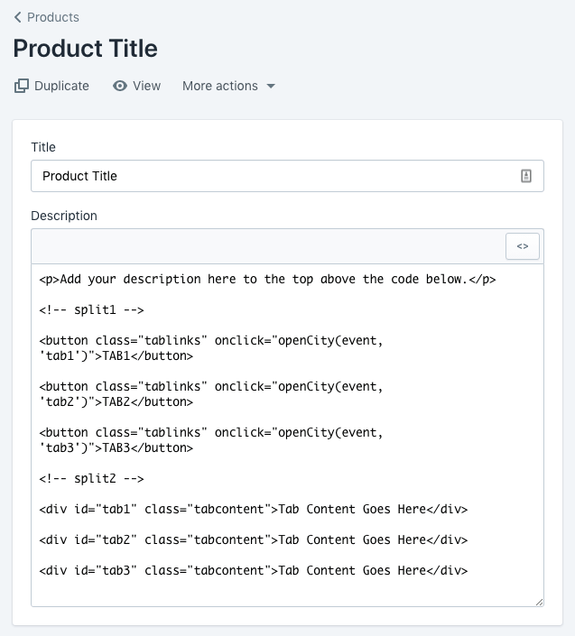
Step 5: The code below will go into the HTML area on the product description level. Modify the content and labels for each tab as needed.
Note: You can add a description as usual. You do not need to add it to the code. You need to add the code below, whatever description you create.

<p>Add your description here to the top above the code below.</p>

<!-- split1 -->

<button class="tablinks" onclick="openCity(event, 'tab1')">TAB1</button>

<button class="tablinks" onclick="openCity(event, 'tab2')">TAB2</button>

<button class="tablinks" onclick="openCity(event, 'tab3')">TAB3</button>

<!-- split2 -->

<div id="tab1" class="tabcontent">Tab Content Goes Here</div>

<div id="tab2" class="tabcontent">Tab Content Goes Here</div>

<div id="tab3" class="tabcontent">Tab Content Goes Here</div>
How to turn the tabs on?
To turn tabs on/off inside your theme, go to your theme area inside Shopify by going to Online Store > Themes > and click "Customize" for the theme you want to edit.
Inside the theme editor, you will click the drop-down at the top and find "Product Pages" > then click on "Product Pages." Scroll down and find "Use Tabs" and tick the box. You can set a custom label for the description tab, the default second tab, and the default third tab.
The third tab links to any content page. Commonly this would be used for a return policy or contact us page, about page, or anything you want to be seen on every product detail page.
If you set the default tabs, then they will show on all product detail pages all the time. If you want to add custom tabs with custom content in addition to the default tabs, then that is when you will add the code above to the product detail page HTML editor when editing a product page.

